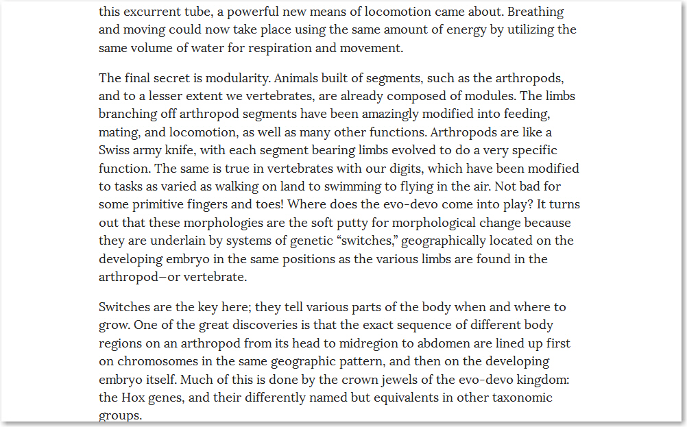
Current one-size-fits-all web design increasingly leans toward the smaller tablet screen – not fitting all well at all, it turns out – and much of it becomes annoyingly large on a full-size desktop screen. The font below, for example, is twice as large as it should sensibly be on my desktop, and makes me feel like I’ve inadvertently picked up a book from the Large Print selection on the bottom shelf at the library. The three screenshots here are each about 1,000 pixels wide – click on any to see that size.
Sometimes these “must fit an iPad mini” fonts get all bright and shouty, much worse than ALL CAPS. When I see something like the story opening below, I automatically think of Garrett Morris on Saturday Night Live. But before that, I squint, wonder if my sunglasses are still in the car, and idly imagine myself phoning the designer to ask sincerely, “Are you an idiot, or are you being intentionally evil?”
Then there are the large print shelf sites also obviously designed by – or for – the colour-blind, in eye pain terms really only one or two steps away from the worst of the Web 0.1 of the mid-1990s:
How is it that a colour scheme like that didn’t get laughed out of the room in early design meetings? At my job some companies ago, they hired a logo design firm, or at least a company claiming to be that. One of the product logos they came up with was so inappropriate as to be unbelievable. It had made it through several meetings, and had been approved by Marketing. So what was wrong with it? Well, it did not mistakenly imply harm to our customers, no no. It actually showed harm to our customers. “What? What? Flthhhhp!” came to mind when I saw it. It was presented to a group of users of the product shortly afterward, and they did laugh it out of the room – and I mean that literally, and I assure you I’m using that word correctly. I’m happy to say that it was never seen again.
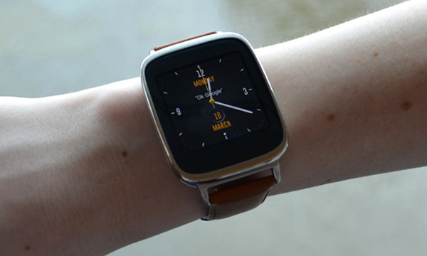
My other “How is it…?” question today is: How is it that reviews of goofily-outsized dumbwatches, the Large Print edition for the forearm, do not all begin with the caption “Tee hee!” underneath the leading photograph? I look forward to saying that myself the first time I see in person some chowderhead wearing one of these “Look at me, all terribly modern and suchlike!” wall clocks.

Tee hee!
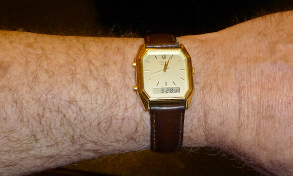
For reference, this is what a wristwatch looks like:

A tad anachronistic, perhaps, but does it elicit a “tee hee!”? I think not.


Hi Lal 🙂
I thought I’d delurk to say I’m one if those chowderheads who wears a Tee Hee watch!
Well, I must know then: Am I the first to point and giggle “Tee hee!”?
The smaller watch says 3:28. Is that GB ?
Had you seen the small SA next to it, I’m sure you’d’ve realised that, in this particular instance, it was local time in Saturn’s 10h39m day. Every two hours, the watch taps my wrist to remind me that it’s been two hours since it presented me with information I didn’t actually need to know, then displays something new. The next display after I took the photo was “002 FL” for “Thus far today, I have presented you with two bits of folderol, including this one.”